Character design / Information design / Exhibition
Plastic Universe
Making plastic recycling approachable for children through playful characters, illustrated stories, and an interactive exhibition.
A big topic for a young audience
Plastic Universe offers an engaging and educational journey into the world of plastics for elementary school children. Our goal was to make learning fun and interactive, introducing plastic materials and recycling methods through lively characters and informative graphics.
The opportunity
Many existing programs spoke mainly to adults, with information that was difficult for elementary school children to understand. We wanted to create approachable resources for children, parents, and educators, helping turn early curiosity into everyday recycling habits.
Research: making recycling understandable
Our research focused on secondary sources: existing programs and campaigns, plastic pollution, recycling methods and policies in different areas, storytelling, and child psychology, including the use of color. We narrowed the project to three challenges.
Complexity
Different plastic types have different compositions and recycling requirements, making everyday recycling decisions difficult.
Contamination
Food residue and other non-recyclable materials can reduce the quality and recyclability of plastic waste.
Everyday habits
Limited awareness, confusing information, and inconsistent habits can lead to improper disposal of plastic items.
Persona - Noah
We used Noah as our research persona to guide the experience for elementary school children. His goals and challenges gave us a concrete audience to keep in mind when shaping the language, characters, and activities.
Noah Travis
Curious, creative, empathetic, and passionate. Noah enjoys nature and spending time with his family, and dreams of becoming a scientist.
Challenges
- Unsure which plastics to recycle.
- Lacks easily accessible resources and knowledge about recycling.
Goals
- Understand and identify different plastic packaging.
- Share what he learns with friends and parents.
- Recycle properly and develop everyday recycling habits.
What this meant for the design
Make information about plastic types easy to digest, give educators and parents a way to introduce the topic, and encourage recycling habits through everyday practice. These goals led us toward a character-led identity rather than a text-heavy explanation.
Branding: a playful visual foundation
The identity combines bold typography with clear color cues. A shared visual language connects the character posters, learning materials, and exhibition so they feel like parts of the same world.
Typography
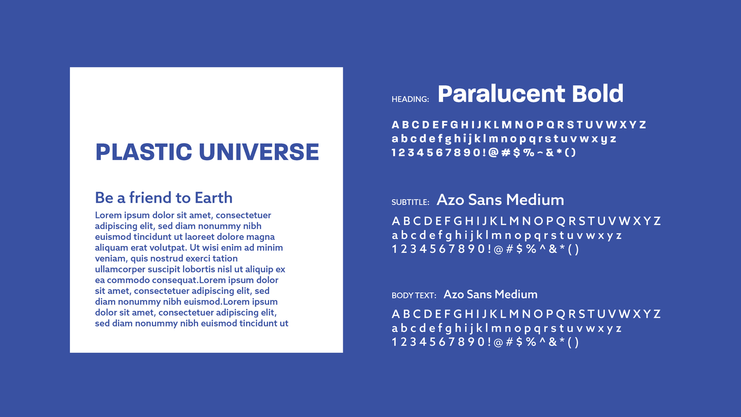
Paralucent Bold gives headings a strong, friendly presence. Azo Sans Medium supports the subtitles and body copy in the project's original typography system.
Color
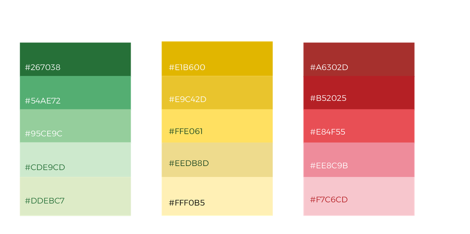
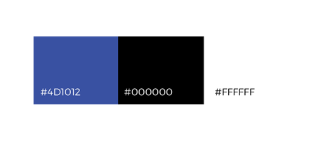
Green, yellow, and red organize the character families, with lighter and darker tones for illustrations and information graphics. Blue, black, and white provide the supporting identity palette.
Character design: from packaging to personality
Each character represents a type of plastic. Familiar packaging shapes, distinct expressions, and names related to the materials helped us turn abstract information into a cast of recognizable personalities.
01 / Start with familiar shapes
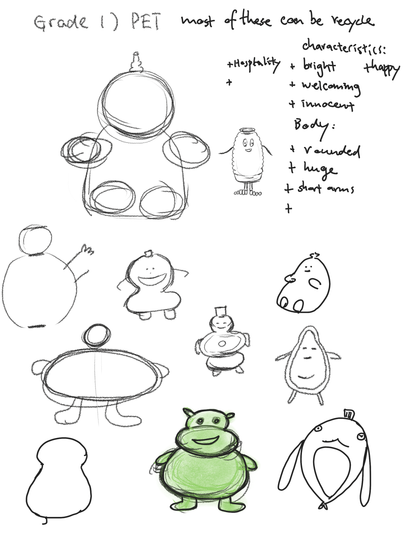
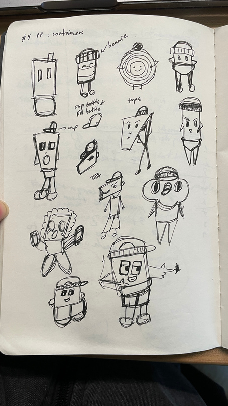
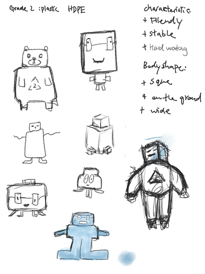
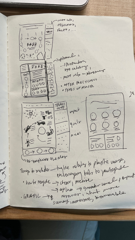
We explored how bottles, containers, and other everyday objects could become characters. The sketches show different silhouettes, faces, and proportions before the visual direction came together.
02 / Explore silhouettes and expressions
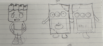
The early iterations moved from pencil studies to colored characters. We explored how distinct shapes and expressions could help children tell the plastic types apart at a glance.
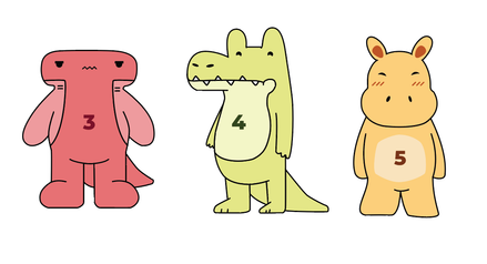
The early digital cast
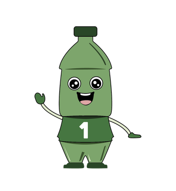
PET / 1
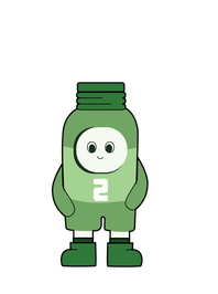
HDPE / 2
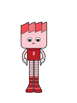
PVC / 3
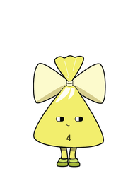
LDPE / 4
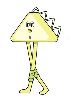
PP / 5
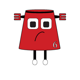
PS / 6
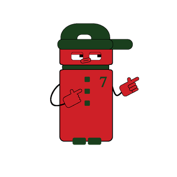
Other plastics / 7
03 / Build a shared visual language
In the exhibition's design system, green, yellow, and red distinguish three recycling categories. Each character pairs a resin number with a material name, familiar objects, and a short introduction. Color provides a quick cue, while shapes and labels carry the information.
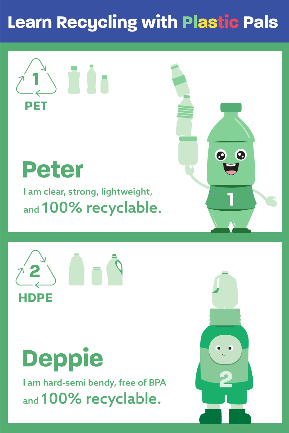
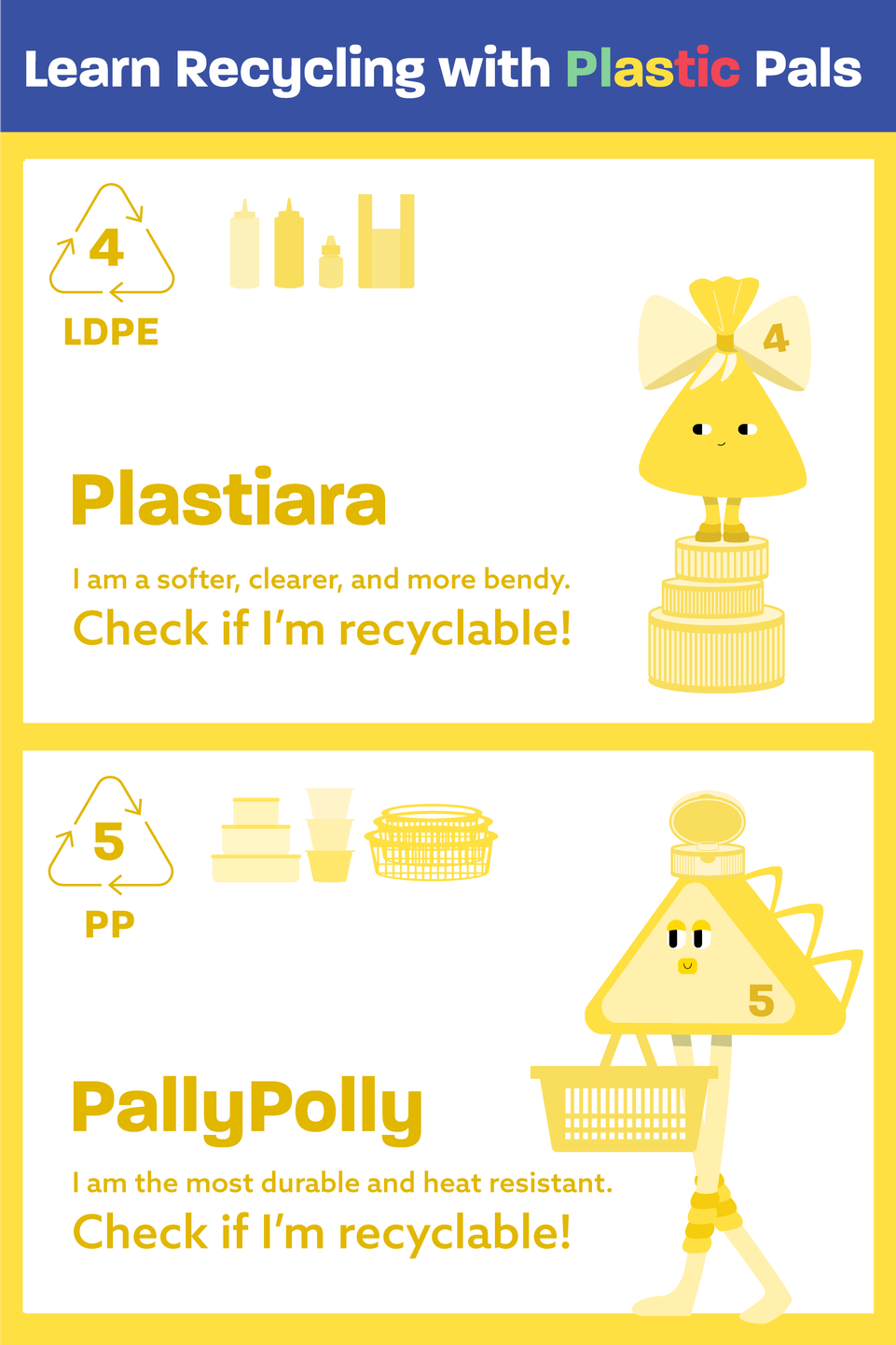
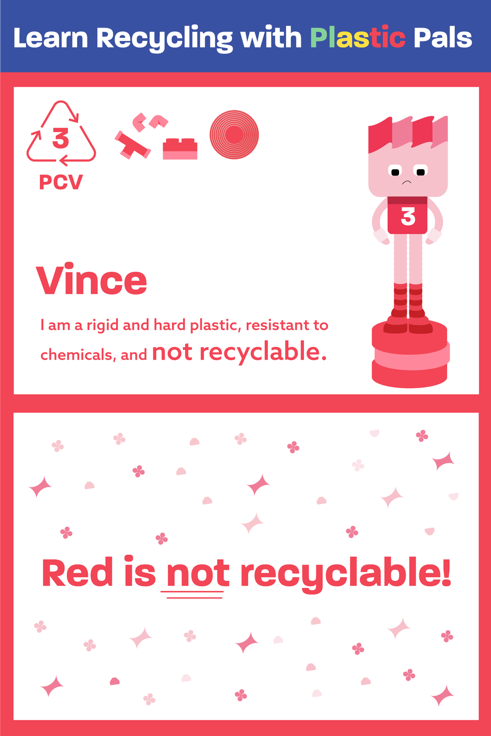
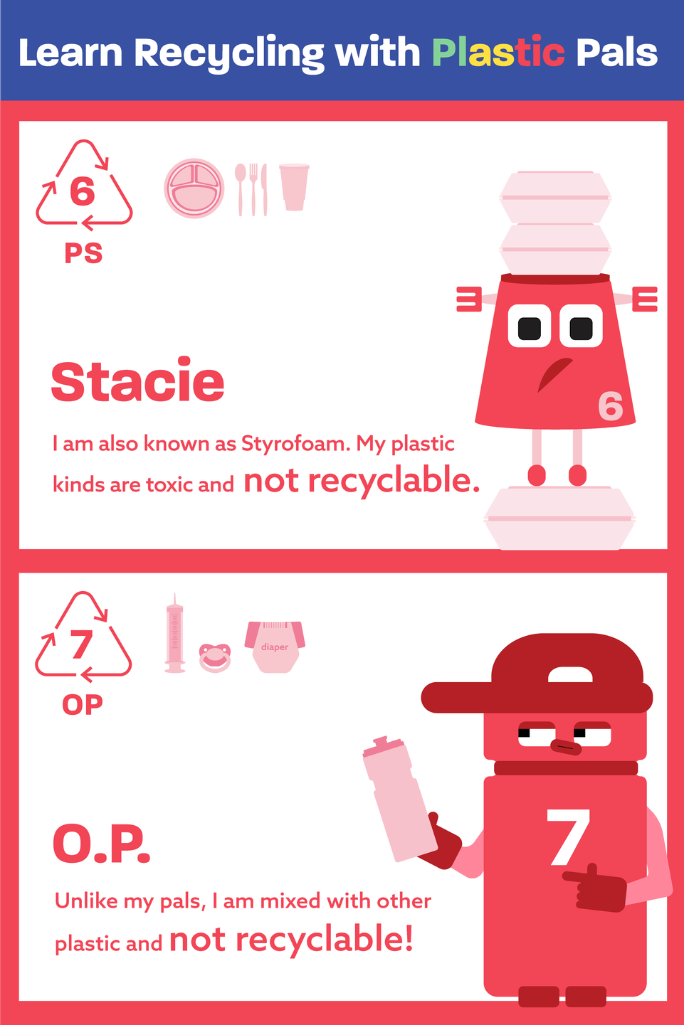
Original exhibition artwork. Recycling acceptance varies by location; follow local collection guidance.
Let the characters tell the story
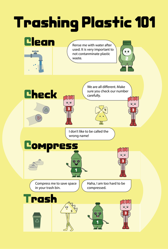
We explored the arrangement of information, vocabulary, and tone to make the graphics easier for children to understand. The characters guide a sequence of cleaning, checking, compressing, and sorting plastic items, turning information into an illustrated story.
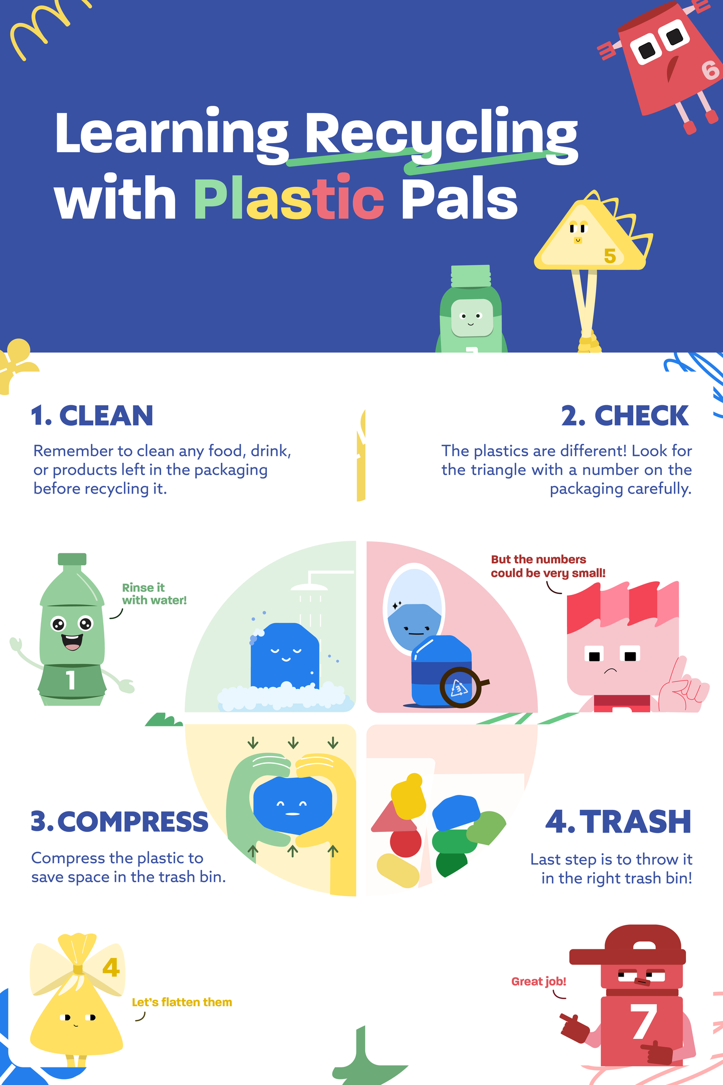
From the page into the room
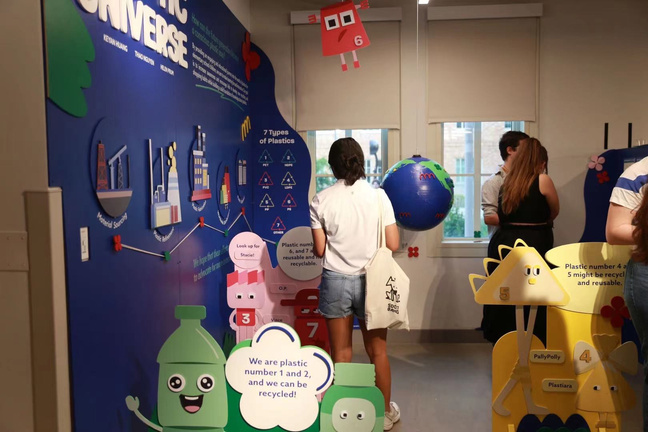
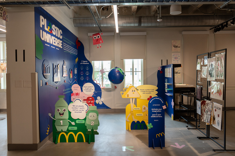
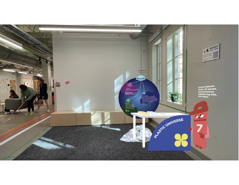
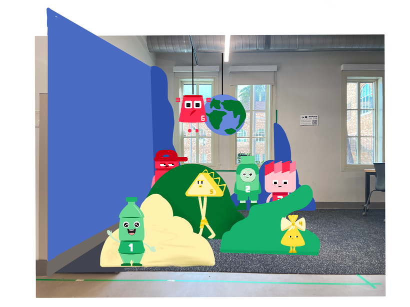
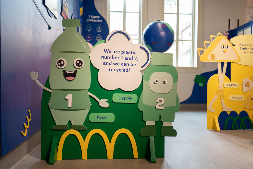
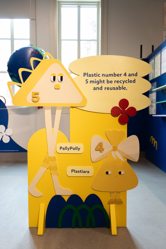
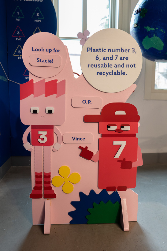
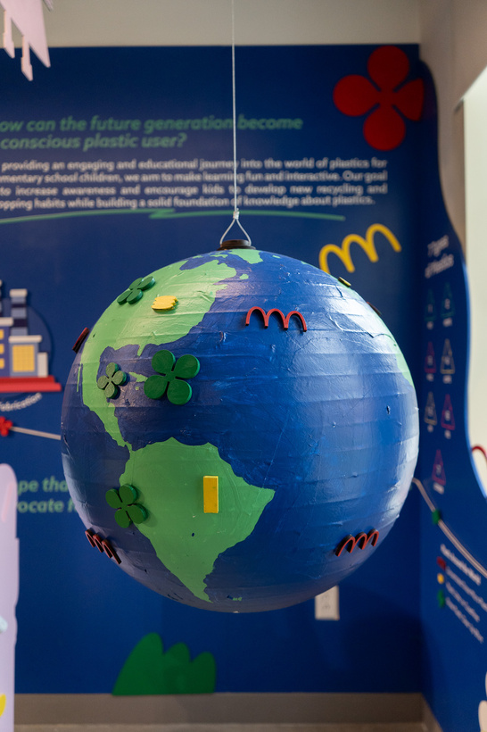
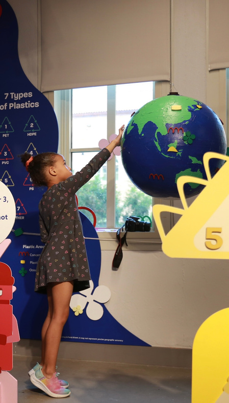
The project began with a strong focus on 2D and information design. After rounds of iterations, we recognized that our brightest elements were the seven characters. We brought them into a walkable exhibition, using panels to guide the narrative and an interactive globe to connect the story back to Plastic Universe.
A universe to explore
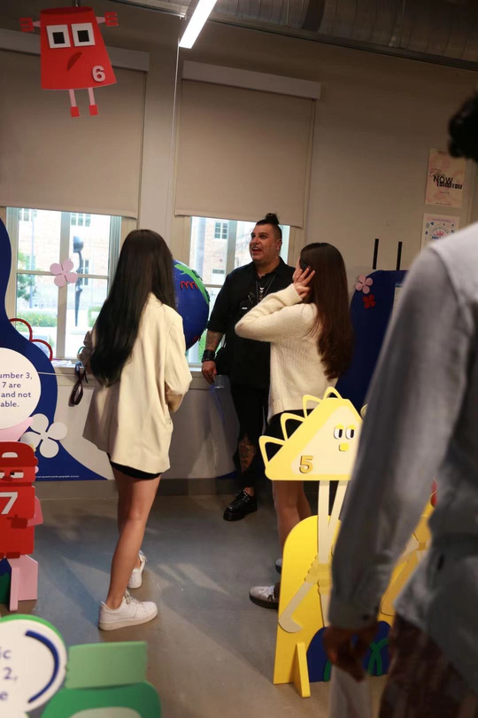
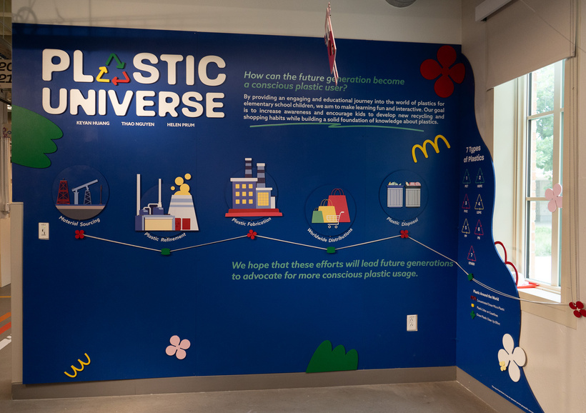
The character panels guide visitors through the space, while the central globe invites them to touch, spin, and discover information marked by different patterns. Together, they create ways to engage with the topic beyond reading a poster.
Opening night
The finished exhibition brought the characters, graphics, and installation together in one space for visitors to explore.